FLAVORS
OF VIETNAM
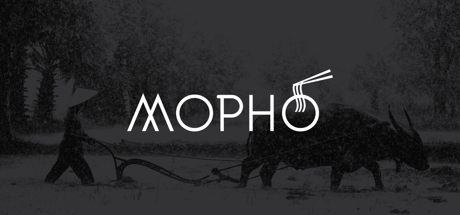
Mopho is a family owned restaurant known for their bold flavors and Vietnamese cuisine. The name is a tongue in cheek wordplay on the traditional Vietnamese soup, known as Pho. With three generations of chefs in the family, the food at Mopho is unique, fresh and flavorful, attributes that they wanted to express in their branding to stand apart from other Southeast Asian Restaurants.
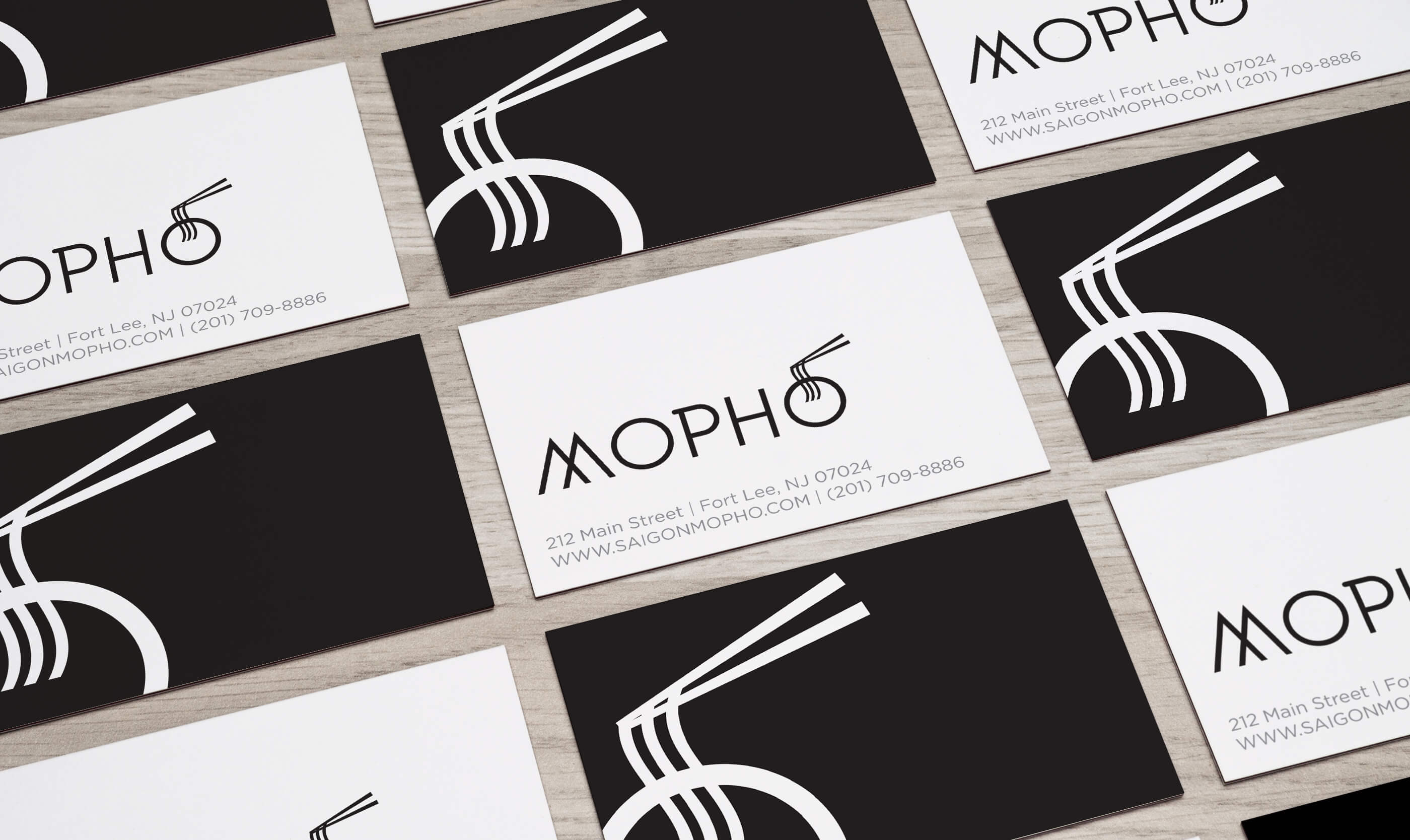
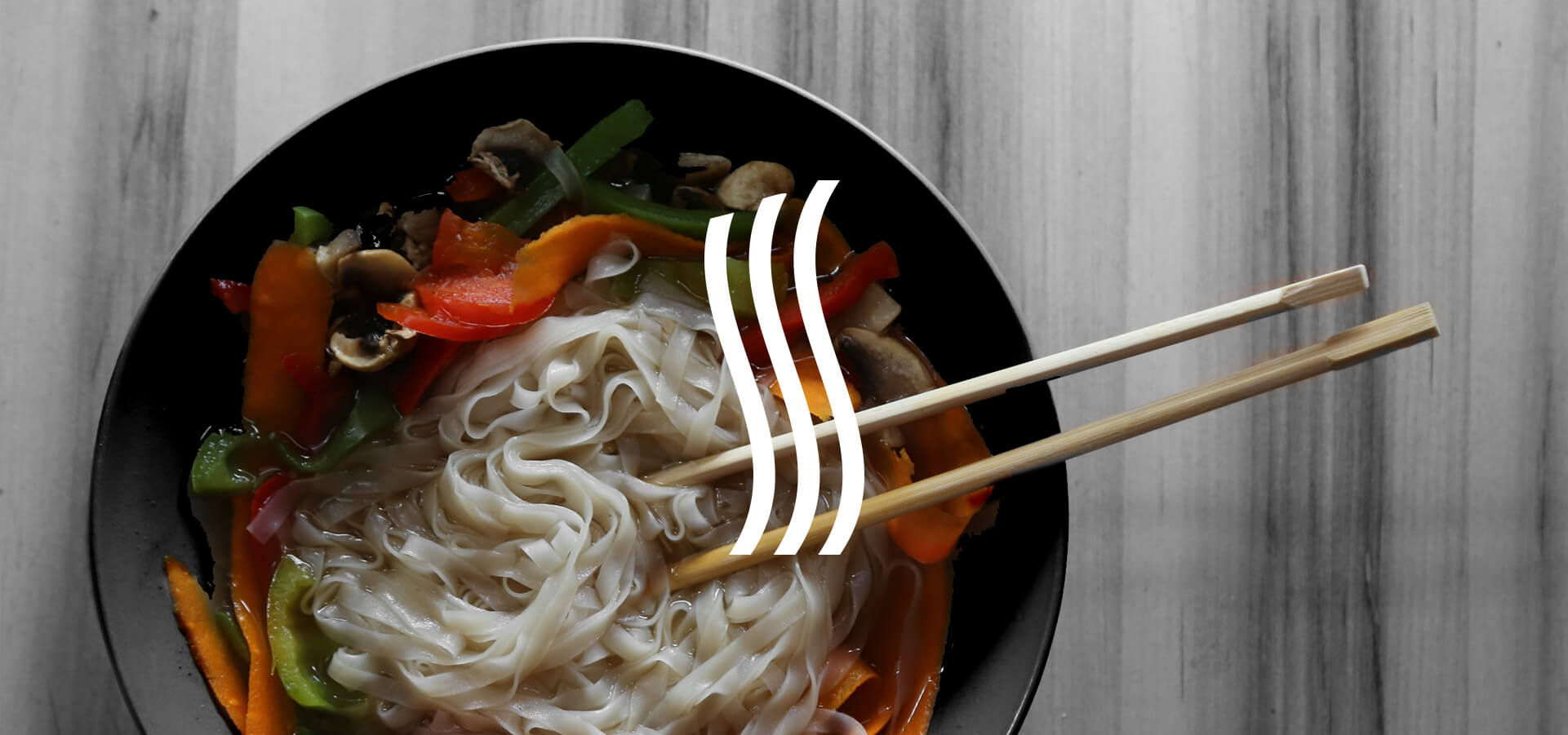
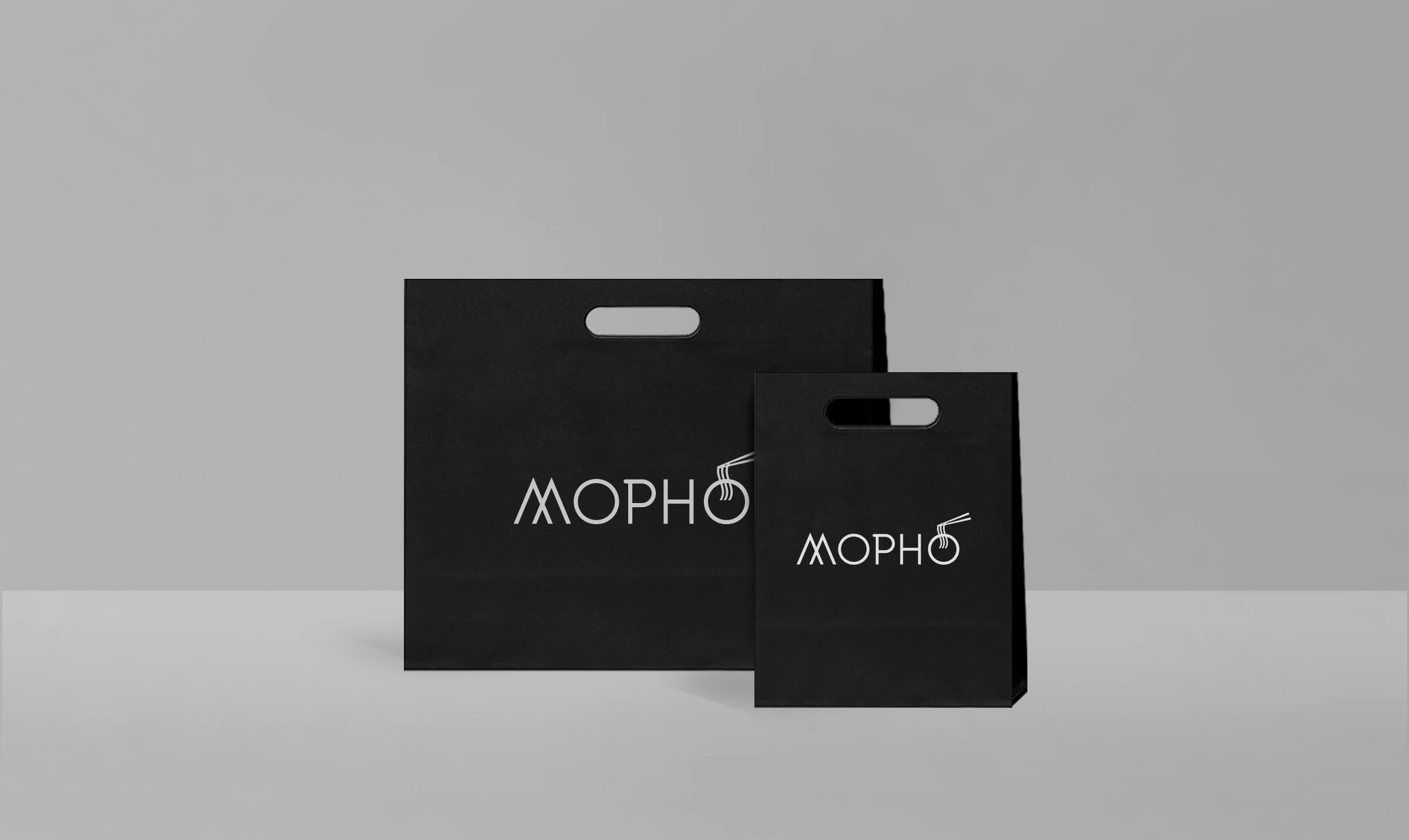
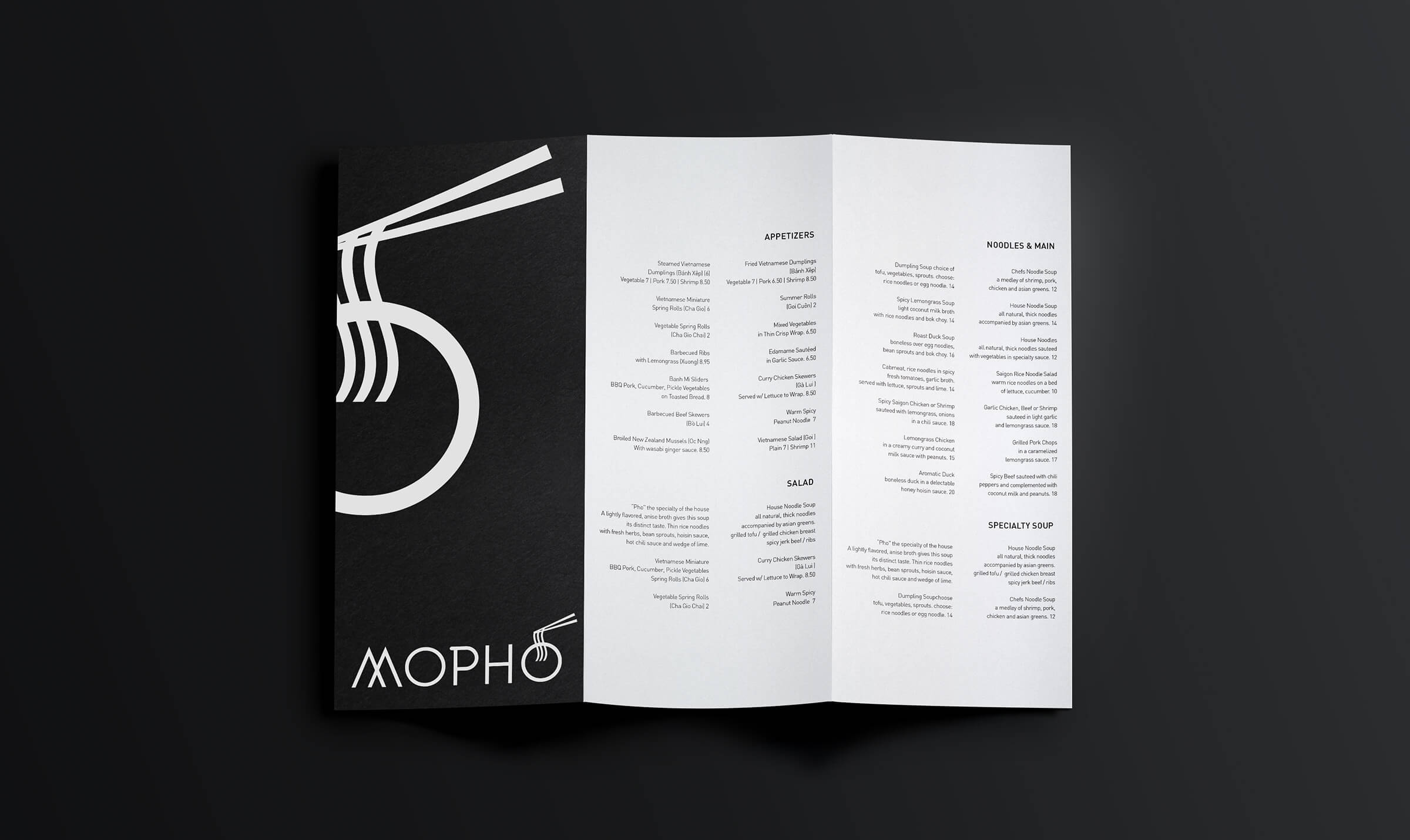
We designed a logo and visual identity for them which was young, modern, metropolitan and slightly playful with the “o” of the wordmark housing their signature Pho soup and chopsticks.
[addtoany]
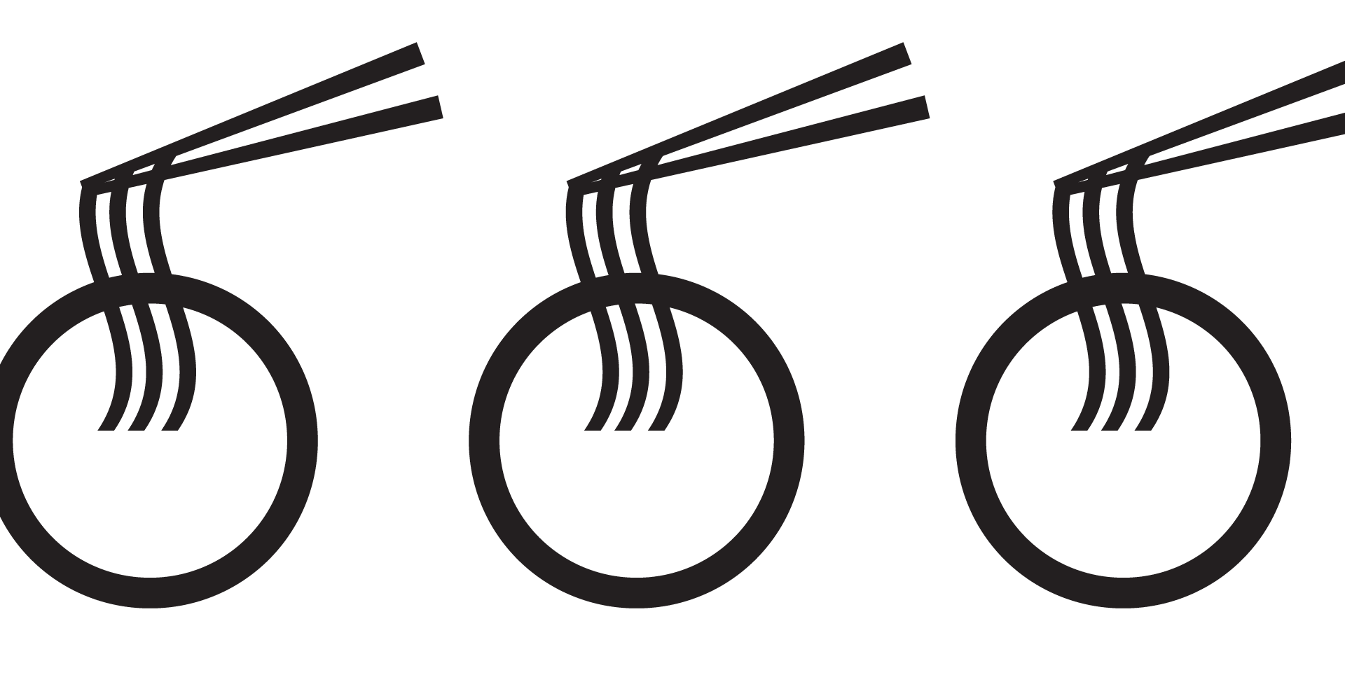
The unique bowl of noodles iconography was an element that could be used as a standalone icon or together with the wordmark. It was also the perfect graphic to be used on T-shirts, patterns and other applications
Ready to get started?
We would welcome the opportunity to work with you! Contact us for more information and to schedule an appointment by phone or in person.