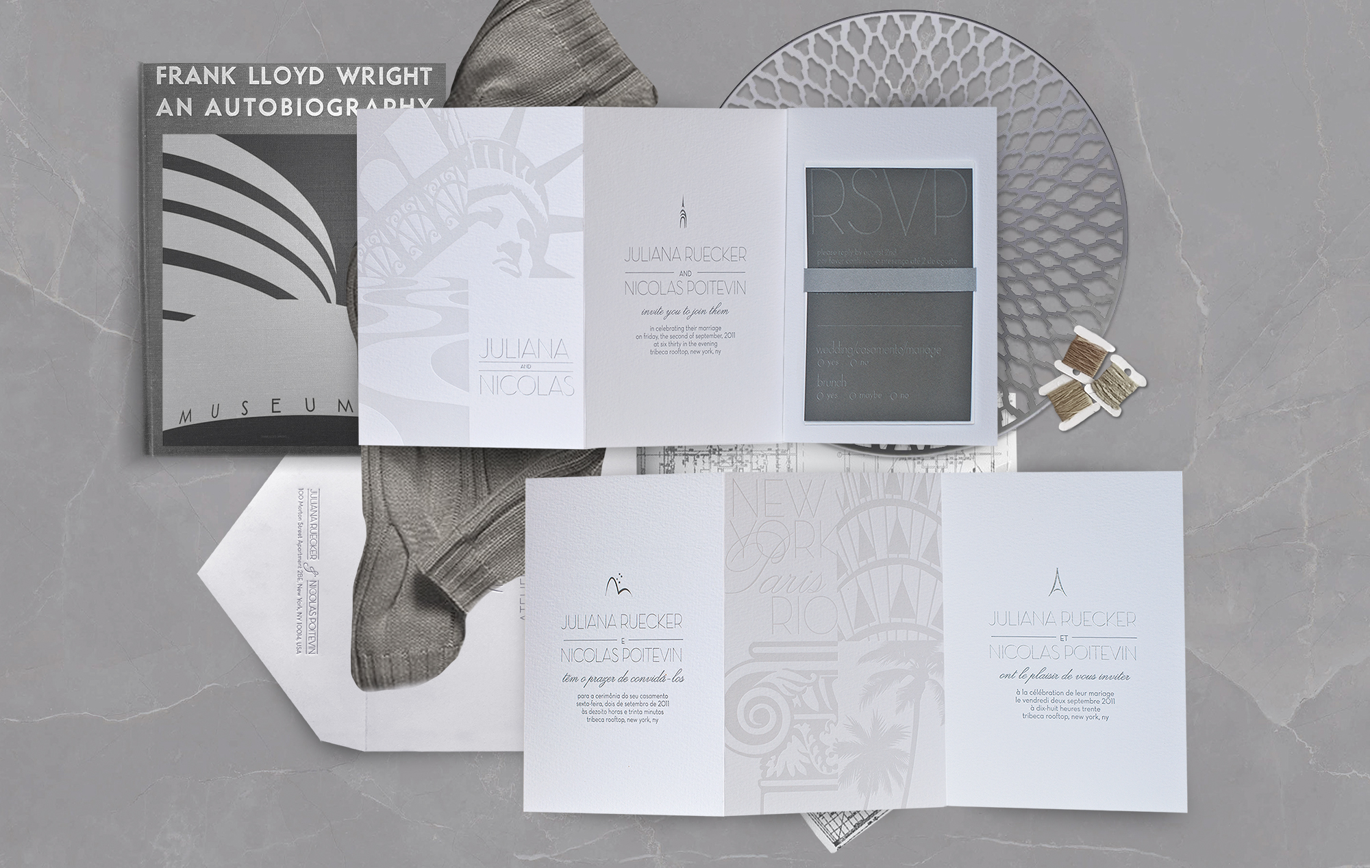
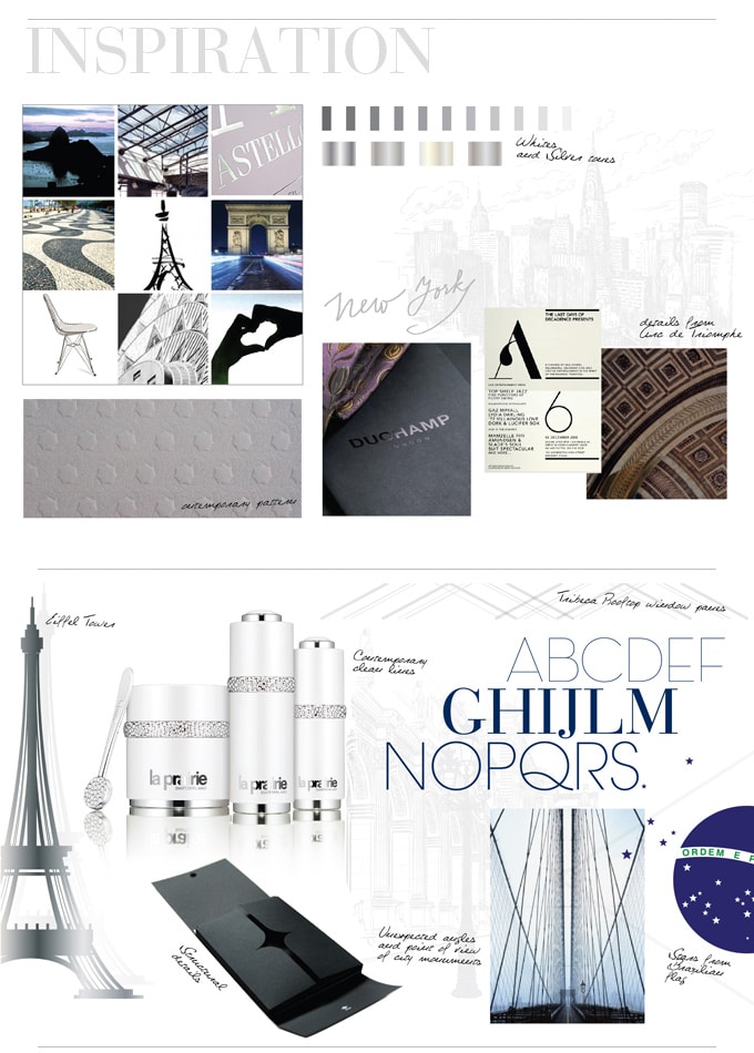
It’s no mystery that I’m a big fan of modern art and design. I love how clean lines, simplicity and minimalism can make just as bold a statement as ornamental design, it’s all a matter of great typography and what you do with all that white space! So when Juliana and Nicolas came to us looking for just that aesthetic, I was excited to revisit all my favorite modern inspirations from furniture giant, Knoll to many of my favorite artists and designers whose work resides at the Cooper Hewitt and Moma Museums.
To start with, the invitation would celebrate the couple’s different heritages and the cities they had called home. It also needed to be tri-lingual and incorporate all three languages (English, French and Portuguese) in equal importance throughout all pieces of the wedding stationery. Now that was a challenge that we were excited to tackle! This week I’m excited to share a brand new behind the scenes of the invitation suite we created for them!
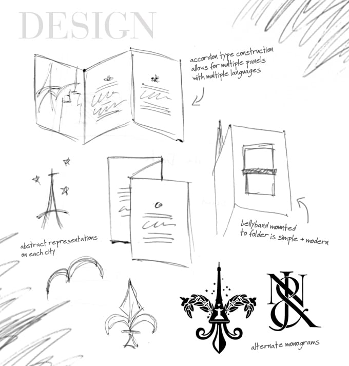
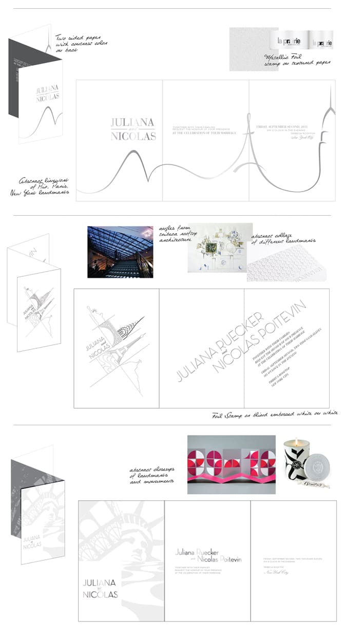
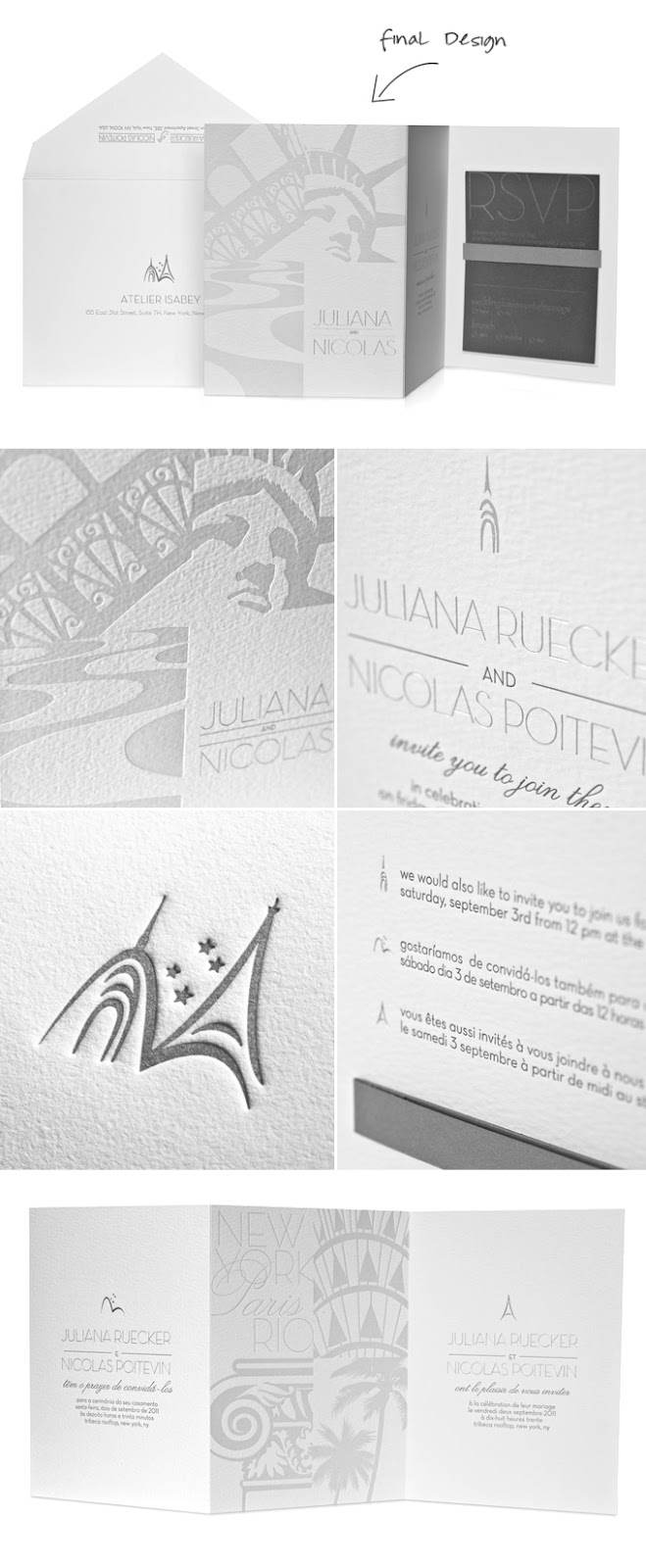
We decided early on that an accordion-fold style booklet would be the perfect construction on which to apply our graphics because of its architectural lines and many surfaces for us to tackle the placement of the different languages.
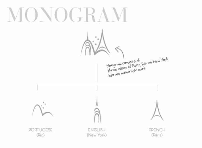
We designed a unique system of modern icons to represent the different languages (Eiffel Tower for French, Sugar Hill for Brazil/Portuguese, etc..). These icons came apart for the different language designations and then locked up together to form the couple’s very own insignia.
When designing graphics for the different cities (Rio, Paris and New York), we wanted to make sure that the imagery and illustrations we used were fresh, contemporary and not cliche in any way which is why we decided on abstract snapshots of icons from those very cities instead of more recognizable ones. This also prompted the guests to examine the invitations a little closer and take them on a journey from the beginning to the end and from front to back.
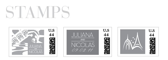
And finally, the finished product! We used ultra-textured watercolor like paper to create a unique surface for us to apply the modern graphics on. Using foil stamping and letterpress printing on different shades of paper also allowed us to play with different effects from matte to shiny and metallics.
Click here To see more pictures of Juliana & Nicolas’ custom wedding invitations!
For more ideas and examples of our custom wedding invitations,
Check out our portfolio!